It has been nearly a year since the first iOS 7 beta, and something about tint color still bugs me. In fact it bothered me enough at the time of the early betas that a filed a bug on it with Apple, something I very rarely do. The problem isn’t so much in the concept of tint color, which I like; having a consistent color for buttons and links, especially now that buttons are so understated, makes a lot of sense. The problem is the implementation in apps that use tint color anytime they want to highlight something, whether it is tappable or not.
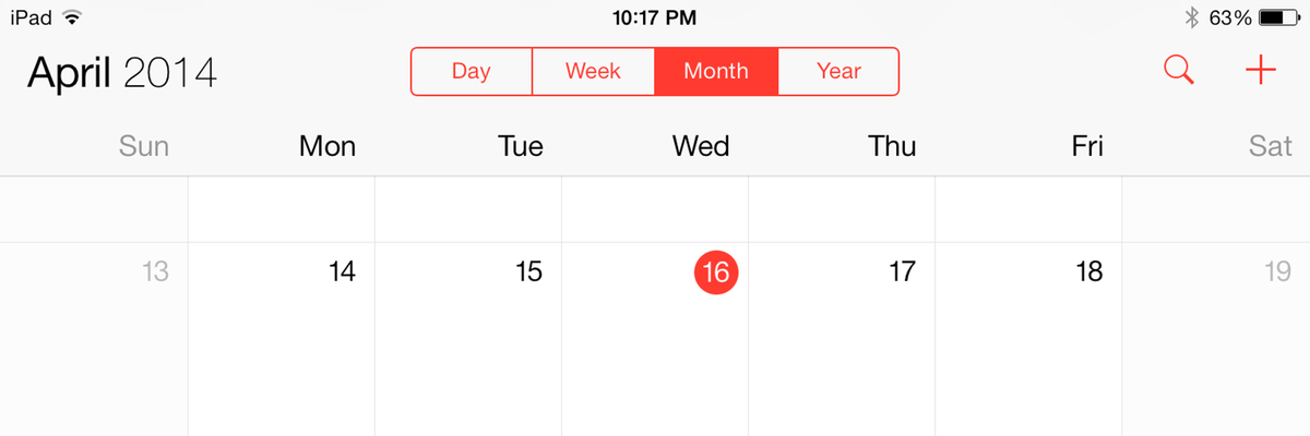
Here’s an example in Apple’s calendar app. It uses a red tint color for buttons, but it also highlights the current day with a round circle using the tint color. It looks tappable, but it’s not.

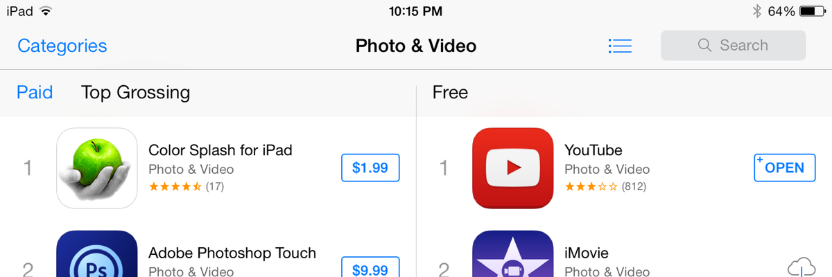
And here’s an even worse example, from the App Store app. “Categories” in this screenshot is a button, but “Paid” directly underneath it — same blue, same font and style — is just highlighted to show that you are viewing paid apps. It’s actually “Top Grossing” that is the button.

These kind of usability mistakes turn the great potential of tint color into a disadvantage. It’s like underlined text on the web that can’t be clicked. Apps should use tint color to improve usability, not to become even more difficult to use than if everyone rolled their own button styles.
Here’s what Apple’s iOS 7 UI Transition Guide says:
“In iOS 7, tint color is a property of UIView. iOS 7 apps often use a tint to define a key color that indicates interactivity and selection state for UI elements throughout the app.”
But that’s not specific enough. The app screenshots above are following this rule, and it still looks wrong. Bold text or a gray background for highlights are much more effective to show selection state than tint color. I would completely avoid tint color for selection state except for controls that have 3 or more segments, such as a tab bar, and even then sparingly. Highlighting a 1- or 2-segment control with tint color is always going to be confusing, because the selected segment looks like it can be tapped.
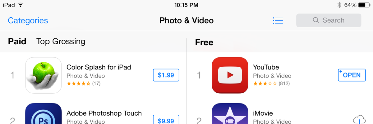
With this in mind, fixing the App Store app is a simple change:

(You could make the “Top Grossing” button blue or not. I don’t think it’s necessary in this case.)
The best iOS 7 apps I’ve seen follow the spirit of Apple’s guidelines, but they know when to push beyond Apple’s built-in apps and when to pull back and do less. Tint color seems like an obvious case of where we should be more consistent and strict than Apple intended.