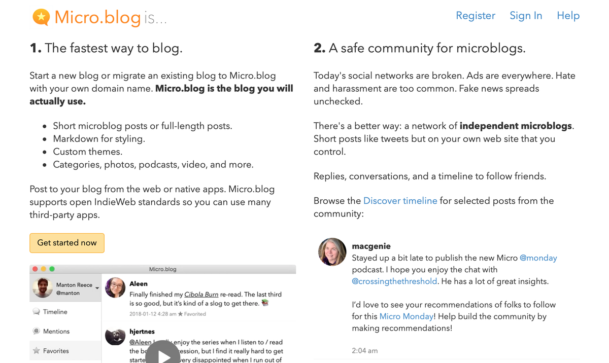
We’ve launched a redesigned home page for new users on Micro.blog today. The old design was a little too sparse and didn’t do a very good job of explaining what Micro.blog is. The challenge is that Micro.blog is really 2 things — a blog hosting platform and a social network for microblogs — so the new design reflects that with a 2-column layout.

To give an example of what posts on Micro.blog look like, we include recent posts from the Discover section directly on the home page. There are also profile photos of the team members at the bottom so that new users have a better idea of who is behind the platform.