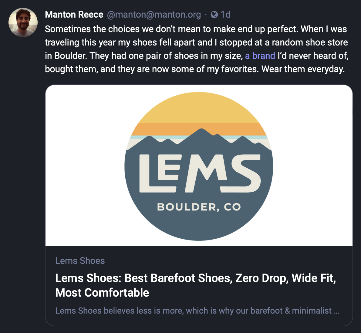
Sometimes people ask for link preview cards in the Micro.blog timeline. Maybe eventually we’ll add them, controlled with a preference. But so often they are in your face, cluttering the timeline, overshadowing perfectly good content. Here’s yesterday’s post on my blog, displayed as intended:

There’s a subtle link on the text “a brand” because I thought people might be curious about the shoes. But that wasn’t the point of the post. I almost didn’t include the link at all.
And now here’s how the same post looks on Mastodon:

What the…? Did I write a short post about serendipity, or did I post an ad for a shoe company?
(Now there is a secondary issue, especially on mobile, where inline links can be confusing or even abused with spam links. There are other ways to solve that.)
So much of social media feels like a show, where everyone is outraged or promoting their own content, the timeline itself just a collection of billboards along the highway, one after another getting your attention. I don’t want that experience. Not having ads is a strength we should lean into.
 Manton Reece
 @abc If you’re only posting a link to a blog post specifically, you mean? Yeah, I can see an argument for that, but most of the current implementations are still too heavy-handed, in my opinion.
 Jamie Thingelstad
 I appreciate not having link previews. We have Markdown and if wanted you can add more adornment yourself.
 Manton Reece
 @jthingelstad Thank you. I agree, that’s a good point.
 JL Gatewood
 honestly for that it just matters if you’re viewing on the native Mastodon web client or not. I pretty much never see those as I’m using Ice Cubes on mobile and Elk/Panphy in the browser on my laptop.
But I do see what you’re saying. It’s a bit distracting. Just expect your first link to pop that big card on Mastodon everytime and prepare accordingly
 Manton Reece
 @starrwulfe I like a lot of the design in Phanpy. It still shows the previews but they are a little smaller. Ivory sometimes shows them way too big, but there is also a setting for it.
 Manton Reece
 @darrenhester Thank you! Yes, that is why ultimately a setting is probably best, so people can opt-in to the experience they want. Also why having multiple apps is a good thing.
 Manton Reece
 @pimoore I’m not sure I ever thought about it exactly this way either until I started writing about it. Seeing my own post with that link preview really struck me.
 David Enzel
 This is the first I have heard of Bluesky. From what they say, Bluesky is growing quickly. Interesting.
 JM
JM I see what you’re saying but there’s a downside to not having any link previews, especially for your own long blog posts. A micropost with just a picture gets more attention on the Timeline that the few hundreds of words you wrote that appear as but a text-only micropost. Moreover, microposts with more than two pictures can be considered a nuisance too for the Timeline.
 Manton Reece
 @moonmehta That’s a good point. There are a couple things there we could improve.
 JL Gatewood
 I for one think the way Craft.do does links (giving the option to keep a simple blue text link or 3 styles of link cards or the embed itself) is perfect. Options are good IMO.
 Manton Reece
 @starrwulfe I’ll check that out. I’ve used Craft but not enough to notice the link styling.
 Numeric Citizen
 I’m ambivalent on that one… It could be a per-post option. Some content would trigger link previews that I want, but some posts would contain so many links. What would be the best to select for the preview? the first one? the last? a few of them? On the latter, I would disable the option altogether.
 Matt Huyck
 @pimoore @pratik I think a good principle here would be that the micro post should appear as the author intended.
Personally, if I start seeing a bunch of these cards that look like advertisements I’m probably just going to hunt down where they’re coming from and unfollow.
 Matt Huyck
 @pratik Personal preference. It sounds as if is leaning in the same direction I am, which is that I don’t want my timeline to look like it’s littered with billboards. It doesn’t matter to me if those billboards are actual advertisements; if they interfere with reading and scanning my timeline I don’t want them.
 JM
JM @pratik
I’ve figured out a way with just text though.
Tell me!
And, I’m surprised that most people don’t seem to find more than 2 pictures in the Timeline to be a clutter but one visual link card is?
 Matt Huyck
 @pratik Oh, sorry for the confusion! No, this does not apply to people posting photos, as far as I’m concerned. People’s photos here are one of the best parts of micro.blog! I could see others having a different take and I like the experiments with other clients to cater to those tastes.

